COVID-19 waves
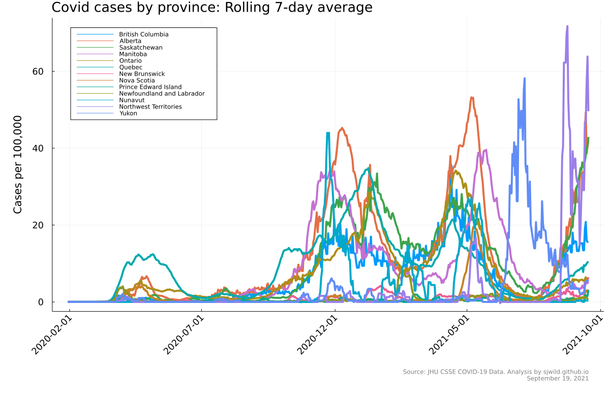
We’re in the fourth wave of COVID-19 here in Canada, so it made sense to me to see how things evolved. I thought I would use Julia to build a gif showing estimated COVID cases over time. You can find the full script here.
I’m going to start by loading in the data.
using Plots, StatsPlots
using CSV, DataFrames
using Dates
using Measures

# Get data on COVID-19 cases
url = "https://raw.githubusercontent.com/CSSEGISandData/COVID-19/master/csse_covid_19_data/csse_covid_19_time_series/time_series_covid19_confirmed_global.csv"
download(url, "covid19.csv")
df = CSV.read("covid19.csv", DataFrame; normalizenames = true)

# Load info about provinces
all_provinces = df[:, :Province_State]
provinces = ["British Columbia", "Alberta", "Saskatchewan", "Manitoba", "Ontario", "Quebec",
             "New Brunswick", "Nova Scotia", "Prince Edward Island", "Newfoundland and Labrador",
             "Nunavut", "Northwest Territories", "Yukon"]
population = [5_142_404, 4_417_006, 1_179_618, 1_378_818, 14_723_497,
              8_572_054, 781_024, 977_043, 159_249, 522_994, 38_966,
              45_201, 41_980]

# Total number of days
num_days = size(df, 2) - 4
With the data loaded, it’s time to clean it. First I’ll build a dataframe with just the Canada data, then I will parse the dates to turn them into the correct format. Finally I will pull out the cases by province and calculate the number of cases per day. Because the dataset gives cumulative cases, we will need to take the difference between days to figure out how many new cases there are per day.
# Create dataframe with Canada-only data
df_canada = copy(df[df.Country_Region .== "Canada", :])
df_provinces = df_canada[df_canada.Province_State .== provinces[1], :]
for i in 2:length(provinces)
    append!(df_provinces, df_canada[df_canada.Province_State .== provinces[i], :])
end

# parse Dates
names_dates = names(df_provinces[:, 5:end])
date_format = Dates.DateFormat("m/d/Y")
names_dates = replace.(names_dates, "_" => "/")
names_dates = chop.(names_dates, head = 1, tail = 0)
names_dates = parse.(Date, names_dates, date_format) .+ Year(2000)


# Matrix of cases
cases = Matrix{Float64}(df_provinces[:, 5:end])
cases = diff(cases, dims = 2)
With this work, it’s time for the first plot.
# Plot cases by day
p = plot(size = (1200, 800), ylabel = "Cases per 100,000",
         left_margin = 10mm, bottom_margin = 22mm,
         xrotation = 45, tickfontsize = 12, guidefontsize = 14,
         legend = :topleft, titlefontsize = 18)
for i in 1:length(provinces)
   p = plot!(p, names_dates[2:end], Vector(cases[i, 1:end]), label = provinces[i], lw = 2)
end
title!(p, "Covid cases by province: Rolling 7-day average", titlelocation = :left)
annotate!(p, names_dates[end], -1600,
          StatsPlots.text("Source: JHU CSSE COVID-19 Data. Analysis by sjwild.github.io\nSeptember 19, 2021", :lower, :right, 8, :grey))

png(p, "static_cases_by_province")

We can see that the data here doesn’t look great. It’s very jagged, which partly reflects the lack of reporting and testing on weekends, and shows that larger provinces had more cases. What we need to do here is normalize by population, so that case counts are comparable. The next chunk of code does that and then creates the plot.
# calculate the 7-day rolling average, then divide by province population
cases_7day = Matrix{Float64}(undef, (length(provinces), length(names_dates) - 8))
for i in 1:length(provinces)
    for j in 8:size(cases, 2)
        cases_7day[i, j-7] = sum(cases[i, (j-7):j]) / 7
        cases_7day[i, j-7] = cases_7day[i, j-7] / population[i] * 100_000
    end
end

dates_7day = names_dates[9:end]


# Plot showing 7 day rolling average
p_7day = plot(size = (1200, 800),
              ylabel = "Cases per 100,000", left_margin = 10mm, bottom_margin = 22mm,
              xrotation = 45, tickfontsize = 12, guidefontsize = 14, legend = :topleft,
              titlefontsize = 18)
for i in 1:length(provinces)
    p_7day = plot!(p_7day, dates_7day, Vector(cases_7day[i, 1:end]), label = provinces[i], lw = 4)
end
title!(p_7day, "Covid cases by province: Rolling 7-day average", titlelocation = :left)
annotate!(p_7day, dates_7day[end], -19,
          StatsPlots.text("Source: JHU CSSE COVID-19 Data. Analysis by sjwild.github.io\nSeptember 19, 2021", :lower, :right, 8, :grey))

png(p_7day, "seven_day_rolling_average_by_province")

Finally, we can create a gif that shows the waves over time. We can watch as the case rates change by day.
# animation
T = length(dates_7day)
anim = @animate for t in 1:T

    p_anim = plot(size = (1200, 800),
              ylabel = "Cases per 100,000", left_margin = 10mm,
              bottom_margin = 22mm, right_margin = 2mm,
              xrotation = 45, tickfontsize = 12, guidefontsize = 14, legend = :topleft,
              titlefontsize = 18, ylims = (0, 65),
              xlims = (dates_7day[1], dates_7day[end] + Day(15)))
    title!(p_anim, "Covid cases by province: Rolling 7-day average", titlelocation = :left)
    for i in 1:length(provinces)
        p_anim = plot!(p_anim, dates_7day[1:t], Vector(cases_7day[i, 1:t]), label = provinces[i], lw = 4)
    end
    annotate!(p_anim, dates_7day[end], -17,
              StatsPlots.text("Source: JHU CSSE COVID-19 Data. Analysis by sjwild.github.io\nSeptember 19, 2021", :lower, :right, 8, :grey))

end

gif(anim, "time_lapse.gif", fps = 20)

Data source
The following the the citation for the data used in this post: COVID-19 Data Repository by the Center for Systems Science and Engineering (CSSE) at Johns Hopkins University: https://github.com/CSSEGISandData/COVID-19.